Using Easy Edit and the Color Picker
Easy Edit
While it's obvious when looking at a site what content needs to be edited, it's not always as straightforward finding that content in the backend. Is it a Link List? Or maybe a Section? Easy Edit removes the hunting game by placing edit links directly on the site for each piece of content that can be edited. Click on one of the edit links and be whisked right to the edit screen in the backend. It's really that easy.
How it Works
Easy Edit is enabled by following the "Easy Edit" link in the backend. The site will appear with edit links (pencil icons) and a toggle for turning Easy Edit on and off. The public will not see Easy Edit (or any pencil icons) on your site; only you will see that.
When Easy Edit is turned off, the toggle flips, but still remains on the page. This removes the need to go through the backend to enable Easy Edit. Just load up the site, hit the toggle, and find the content to edit.
Bookmarklet
For those who work on multiple sites on a daily basis, a bookmarklet can be used to enable Easy Edit on a site without using the toggle. To add this bookmarklet, create a Bookmark in your web browser for Easy Edit. Copy and paste the following code into the "URL" or "Page" field for this bookmark and Save it. Now when you click this bookmark, you'll enable Easy Edit for the current site you're viewing.
javascript:(function(){var loc=location.href;loc.indexOf('?')==-1?(location.href=loc+'?easyEditOn'):(location.href=loc+'&easyEditOn');})();Disabling
While the concept of Easy Edit is simple, the frontend magic that makes this happen is a bit more complex. Add in the myriad of ways that sites can be implemented on our system, and there may be some instances where Easy Edit breaks the site in a few ways. If this happens, let us know! There may be a workaround that we can build into the Easy Edit system.
Color Picker
To access the Color Picker, log into your Ekklesia 360 account and then click the “Easy Edit” button in the top right of your dashboard. The color picker will slide out from the side of your browser window (on the right or the left depending on your menu formatting). Click on the color palette tab.
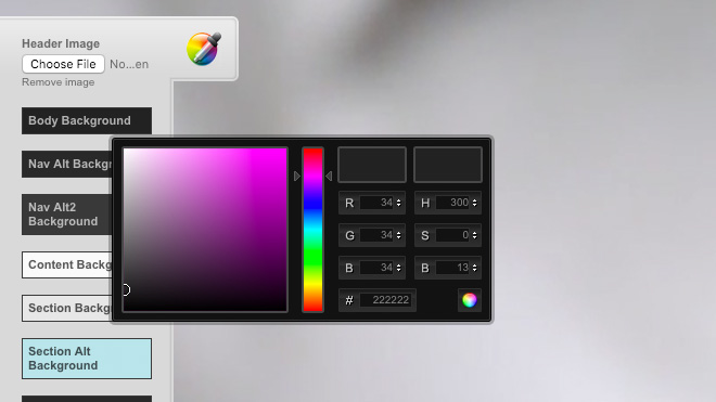
When you open up the color picker, you will notice fields for different elements of your website. Clicking on any of those fields will open the color picker panel. The color picker has fields for both HEX and RGB color code options. The two systems are more or less interchangeable, but I recommend using HEX codes simply because it is the quickest to input.
There are a few different ways that a specific color can be represented digitally.
- HEX: This is a 6 digit code (numbers and letters) used for HTML, CSS, SVG. The field is represented as (#) in the color picker.
- RGB: This stands for Red, Green, Blue. Percentages of each color are added together to make each color on a computer screen.
- CMYK: you may be familiar with CMYK, but you won’t see these options in the color picker. CMYK stands for cyan, magenta, yellow and black. CMYK is used for print not digital. These are typically the 4 colors of ink used in a printer.
You will also see HSB: This stands for Hue, Saturation and Brightness. Once you have set your HEX or RGB colors, the HSB fields can be used to make that specific color darker, lighter, and more or less intense.

