Web Design Fundamentals
Layout
The layout of your site should serve a number of purposes beyond simply making your site attractive.
A good layout will:
- Organize your content visually
- Offer intuitive ways to navigate your site
- Present content in a sensible and obvious hierarchy
- Guide the user’s eye through each page
Entire books have been written about the creation of web layouts. We will simply list some proven conventions.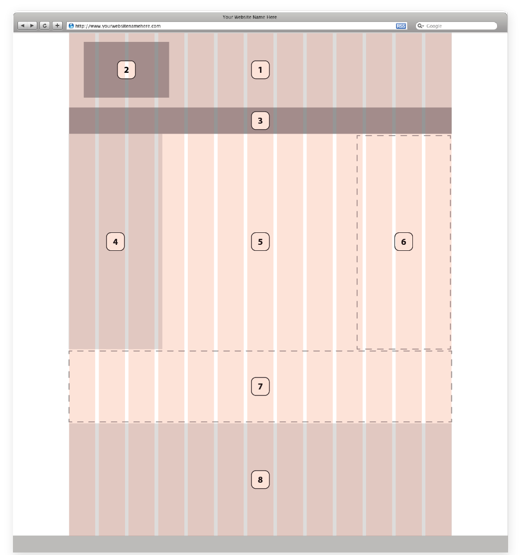
General Layout Elements
Figure 1 shows a typical web subpage layout. The layout includes the following commonly-used elements:
- Header: includes site logo, main navigation, any optional “utility items” (search, contact us, other global features)
- Site Logo/Home Link: It has become a common and is an expected convention to have the site logo at the top left. Though this is not a hard and fast rule, the majority of users will expect this functionality.
- Main Navigation: the global navigation is generally found in the header area.
- Sidebar: Ideal for secondary content. Commonly includes:
-
Sub Navigation e.g., a list of pages that are “siblings” or “children” to the current page in the navigation hierarchy
-
Content Filters for output like blog categories, podcasts by date, articles by author, etc.
-
Featured Content e.g., “Latest Podcast,” “Newsletter Signup,” etc.
-
Content Related to the current page, article, etc.
Note: the sidebar can be placed on either side, and the “proper” side has been long debated. The left side is more traditional, but not necessarily better. Some would argue that a right sidebar allows the main content area to take priority for left-to-right readers, and others would say that left placement is the accepted convention and what is expected. A suggested rule of thumb is that if your sidebar contains navigational elements, the left side is most appropriate and intuitive; if the content is secondary and peripheral (recent comments, related content, advertisements, etc.), then right placement is best. Keeping sidebars consistent from template to template is important to give a user the most intuitive experience. -
- Main Content: This is the most important area of each page, serving as the focal point for content. This area is the reason your user has gone to the page. Emphasis should be on legibility and uncluttered design.
- Second Sidebar: Many content-heavy sites use a 3-column layout. Some would argue that this detracts from the visual hierarchy and adds clutter, but in some cases it is necessary. Note that a second sidebar will significantly reduce the width of your main content area, thus forcing the content down and requiring more scrolling on each page. Consider only using a second sidebar if your client needs a large amount of secondary content that, in only one sidebar, would push secondary content. For example, if you have navigation, a search bar or area, and content filters on the left side and need a calendar and recent article list, perhaps utilizing a second sidebar would be appropriate. An alternative to using a second sidebar would be the next item, the “Basement.”
- “Basement”: In the last several years a trend has been toward using the area above the footer for globally-displayed secondary content. This can be a good alternative to a second sidebar.
- Footer: Footer content generally includes copyright info, design/development credits and sometimes global links like Contact Us, Privacy Policy, etc.