Creating a Visual Site Map
What is a Site Map?
Site maps are a great way to show a big picture overview of your website. Site maps are good at showing the relationship your pages have to each other and the overall hierarchy of your site. For this specific exercise, we will focus on a visual sitemap that is used to help communicate how visitors will be able to navigate and get to the content they are looking for.
Creating an initial site map will start the process for getting your content prepared for your new site. As you begin to layout your initial site map you can be as simple or as complex as you would like. We recommend you start simple. Often times less content is better and the smaller your sitemap the easier it is for people to locate what they are looking for.
General Information about creating a Site Map.
In this first phase of creating a site map try not to think about all of the content that you already have, now is your chance to purge some old content and craft your website around those people who are going to be using your site. It's a fresh start.
To begin creating your site map you want to think about who is going to use your site. We often think about New visitors, Regular attendees, Engaged members, and your Maturing members. Each of these categories can help you think about how you're placing your content on your site and why it's there.
For example, a new visitor will most likely be looking for information on service times and what to expect when they visit where an engaged member will most likely be looking for next steps to grow or serve their local church.
Your site map should be setup in such a way that it delivers the information to the intended audience in the easiest to understand way. Using language that is understood by the intended audience is important as you layout your page titles and content.
For example, if your Men's Ministry is called “Sons of Thunder”, having this title on your website does not communicate that it's a Men's ministry to a new visitor very well, it might just be best to have your navigation read “Men's Ministry” and then when someone navigates to that page, they can now clearly be presented with the name of your Men's Ministry.
Below you will find an example of a sitemap. This is to help you start with a baseline to start creating one for your own site. As you can see in the example below we start at the top from the homepage of the site and then move down or "into" the site through various paths. For example, the "I'm New Here" path will take a "New Visitor" to the information they are most likely looking for, things like directions and service times should be easy to find when someone selects the "I'm New Here" option.
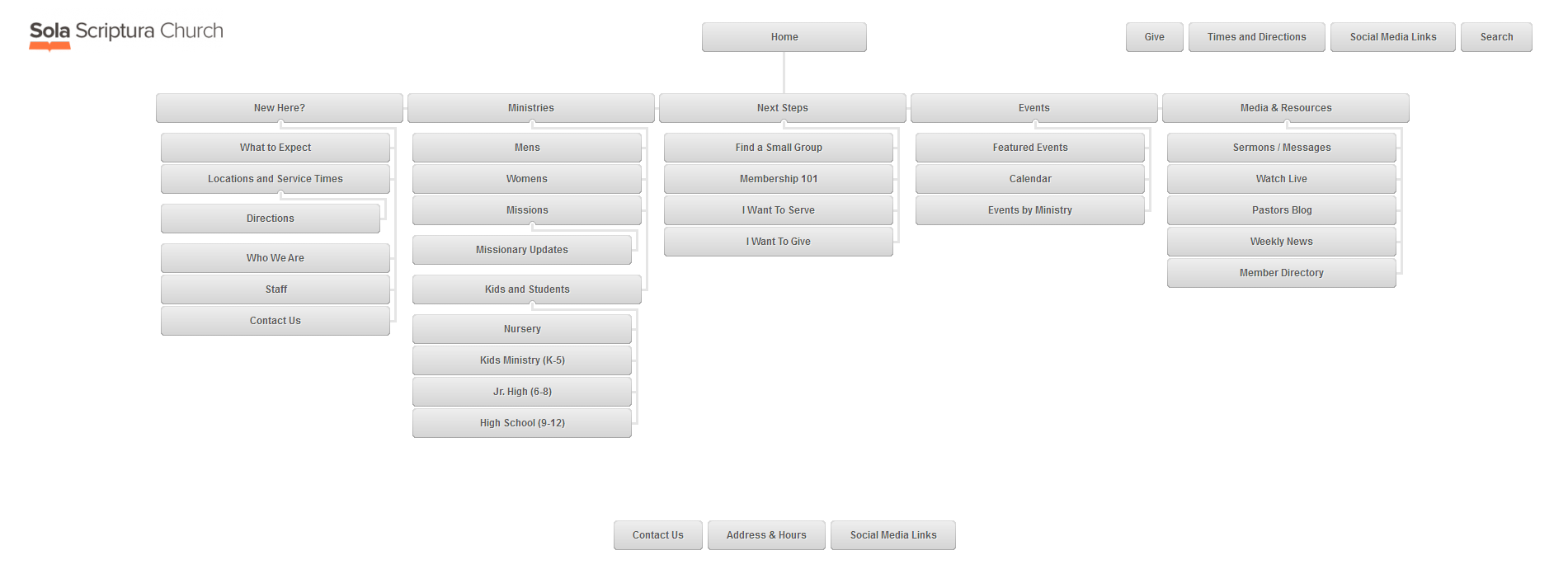 Click to View Larger Image
Creating your Site Map
Step 1: Identify Your Visitors and the information they will want.
To get started, grab a piece of paper and a pencil and begin to think about who is visiting your site and what information they will most likely be looking for. If you already have a site and are using some sort of "analytics" on that site now is a great time to look at those analytics and see what people are actually using on your site. Here are a couple examples of some brain-storming sessions around the various types of visitors to a site and the information they would most likely want to see.
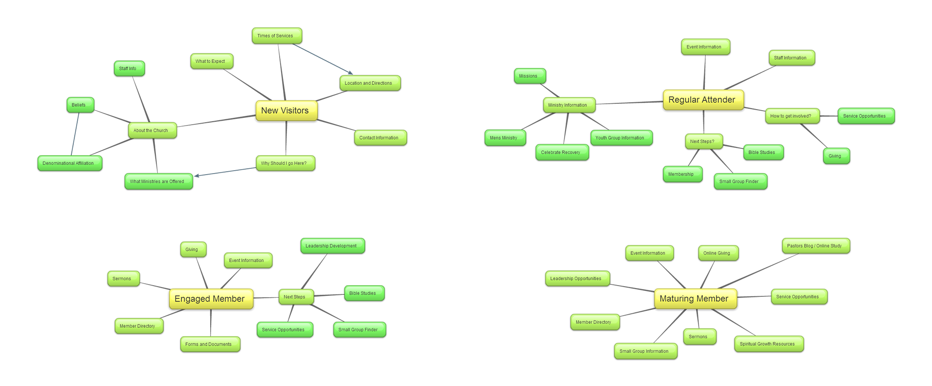 Click to View Larger Image
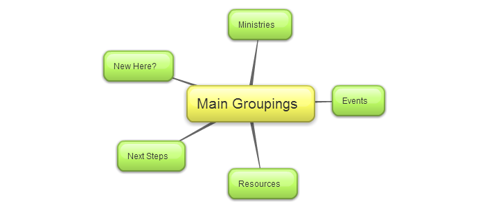
Step 2: Find Groupings and Define Clear Paths
Once you have identified the various visitor types, such as New, Regular, Engaged, and Maturing, you can now start to put it all together. Take a look at the content that each type of person visiting your site is looking for (another great time to consider any analytics data you may already have). Can you find patterns or groupings of information? Are there specific "calls to action" that each type of person would be more likely to click on?
For example, we can see that there is a consistency in all of our groups (New, Regular, Engaged, and Maturing) looking for "Next Steps", these next steps can be different for the various groups of people but they would all be likely to click on a "Next Steps" button or link and then choose the step they are looking for. So under next steps we can have things like membership, small group finder, service opportunities, etc... so that no matter which type of person clicked on the "Next Steps" call to action they would find what they are looking for. Below is an example of the group headings we came up with.
Step 3: Categorize content under your main groupings
Now that you have your main groupings, you can begin to categorize the other content under each grouping title. Go through your brainstorming session and begin to move the content under your main grouping headings. For example, your "New Here" heading will most likely be the best place to have information about your ministry, staff, times and locations. Under the heading "Next Steps" you could have things like Small Group information, service opportunities, and spiritual growth classes information.
As you begin to segment out your content you may find that some items fit equally under a couple different headings. First, try to determine where most people will go to look for the information to try and minimize linking to the same content from within your main menu. You can always set it up in both locations and then use your website analytics to determine which location is the most popular and drop it down to one location later on.
If you find content that does not clearly fit under a main grouping there are a couple options. If its really important content, but not quite a main grouping then maybe a quick-link in the header or on the homepage of the site will serve its purpose here. This is often the case for a link to "Contact Us". We will talk more about this in the next step.
At this point you should have a basic site-map. The next step is sometimes the hardest part, prioritizing your content.
Step 4: Prioritize your content
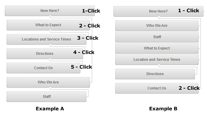
Now that you have setup your main group headings and segmented your content under each of those headings its time to prioritize the levels at which the content displays. Most of the content on your site should be accessible within a couple clicks. One common mistake we see made is content getting buried so deep within a site that no one ever finds it because they would have to follow the exact path of clicks to get to that specific piece of content.
The example below illustrates how content can be buried too deep. In example A it takes 5 clicks to get to the Contact Us information, whereas in example B it only takes 2 clicks to get to the same information.
How much content is too much?
While we want to communicate lots of information to our visitors, chances are they are looking for specific information. Our goal is to get them this information as quickly as possible before they give up and leave our site. To much information right up front will overwhelm your average visitor and they will leave, but to little information up front and having to click around to find the content will cause them to leave as well. Try to limit your first couple levels to that truly important information and clear titles that your visitors will understand.
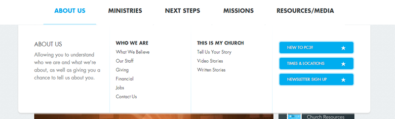
Below is an example of a site where they used a "Mega-Nav" menu to display a large amount of options all at the same time. This menu allows someone looking for information about the church to easily see the information about the church as well as direct them to common content such as New Here, Directions, or Contact Us.
If you find yourself with lots of information you're looking to convey it might be time to think about using a mega-menu on your site. If your site does not currently have a mega-menu contact your On-boarding Specialist or our support team to get this option scoped out for your site.
Step 5: Finalize your site map
Now that you have completed steps 1-4, you can "finalize" your site map. While its true your site map is never truly "final" you do want to have a solid foundation to turn to when setting up your site. Content will always try to creep onto your site and it always seems to be important. Having a pretty rigid sitemap will help you make better decisions around what content goes, what content stays, and if it stays where it should be placed on the site. As you finalize your sitemap, you should end up with something that has clear group headings and then the sub-content for each of those headings.
Tools to Help:
The following tools are third party products* that can assist in creating your site map. We used these two tools whole creating this help document.
http://slickplan.com/ - Sitemap creation tool
https://bubbl.us/ - Online brainstorming tool
Other useful tools are:
https://docs.google.com - Google spreadsheets can be useful in setting up a spreadsheet to manage your sitemap. Spreadsheets are great if you have large amounts of content.
Microsoft Excel - Use a spreadsheet to create your sitemap. Spreadsheets are great if you have large amounts of content.
Presentation software such as PowerPoint, Keynote, or Prezi.
*Unfortunately, because these are third party tools we cannot provide any support in using them.