Creating Responsive Columns
You can create a multi-column layout in your pages and content sections by adding some custom HTML into the page. This method requires a few additional steps than using a Table element, however it is preferred for creating responsive (mobile-friendly) content.
Luckily, our Grid Generator tool can provide the HTML you need for your page.
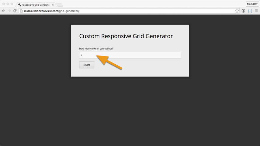
1. Open /grid-generator/
A Grid Generator may be available already on your site at: "mysite.com/grid-generator/". If not, you can find the tool here as well:
http://tools.ekklesia360.com/grid-generator/
2. Add rows
Select the number of rows you'll need for your layout.
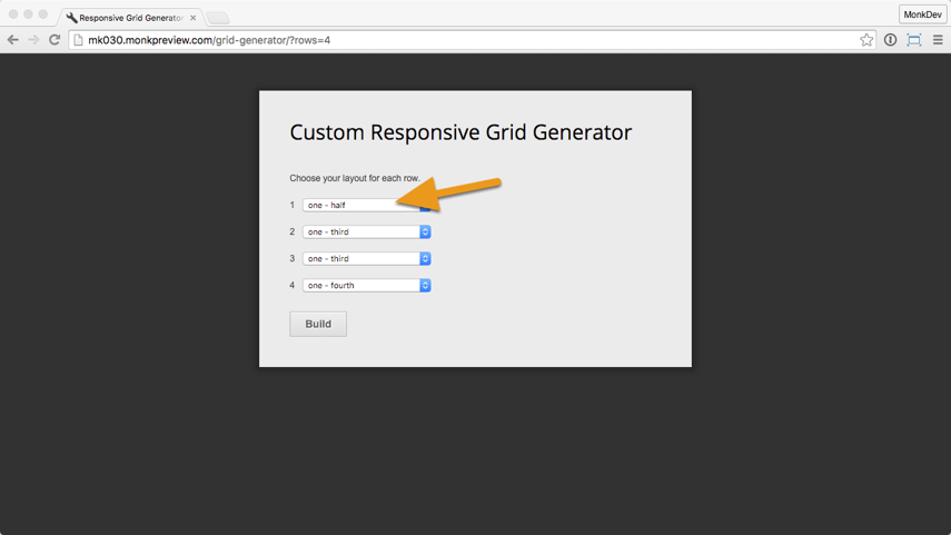
3. Choose layouts
For each row, select how many columns you'll need. For example, "half-half" will give you two columns, each one using half the page.
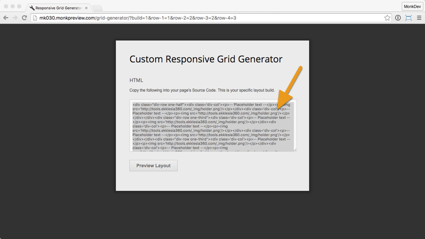
4. Copy source code
When done, copy the HTML and CSS code snippet generated, or click "Preview" to see how the layout is set up.
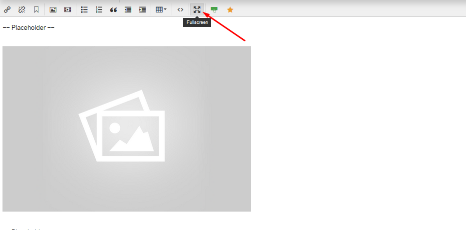
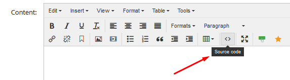
5. Open page source code & custom CSS
In your page, open the Source Code "<>" editor.
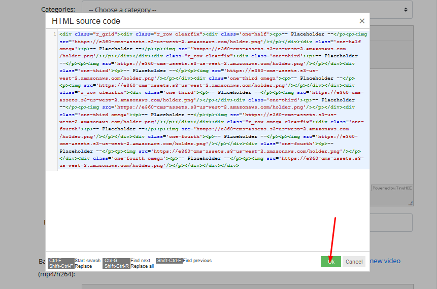
6. Paste source code & CSS code
Paste the snippet there (Ctrl / Cmd + V), and click OK.
Paste the CSS code into the Custom CSS area towards the bottom.
7. Add your content
The grid is in place! Some example text and an image is placed in each cell. Place your cursor there and add your own content to complete the layout. The FullScreen button on the right side of the toolbar is helpful for editing grids.