Tips For Images On Your Website
This is a detailed walk-through on creating and using images with Ekklesia 360. For help uploading image files, refer to Adding Media.
Supported formats
The following formats are supported by Ekklesia 360 and will be recognized as image files.
- JPG
- PNG
- GIF
- SVG
Other formats may be uploaded, but may not be compatible with the Image Resizing/caching system.
Color modes: RGB v. CMYK
All images used on your website should be using the RGB color mode.
An image file has both a file type and a color mode. While the file type dictates how the digital information is stored in the file, the color mode defines how the basic colors are mixed to form the resulting image. Color modes will vary depending on the usage intent of the image.
For images intended for print, the CMYK color mode is used to allow printers to read exactly how much Cyan, Magenta, Yellow, and Black ink should be used to make a print. For the web, images should use the RGB color mode, which is optimized specifically for screens which project Red, Green, and Blue light. Because CMYK images are intended for print, some web browsers do not support them.
If you have a CMYK image and are not sure how to convert it to RGB, you can use any good image editing tool, like the ones below, for conversion.
What Size Image Do I Upload?
We recommend keeping all individual image files under 1 MB. You can keep an image high resolution while keeping the file size small. This helps your site load faster!
When saving your image, try reducing the file size by making sure you save it as a .png or .jpg file at 72dpi. Typically you can export the image in a "Save for Web" mode on photo editing programs. Here is a list of helpful editing tools: help.ekklesia360.com/article/image-editing-tools
How Big Is A Specific Image On My Website?
Trying to find out the pixel size (height and width) of an image that is on your website? Take a look at the following link for instructions on how to do that: help.ekklesia360.com/article/locating-an-image-size-on-your-website
Automatic resizing
All sites using Ekklesia 360 can take advantage of the fantastic Image Caching API, which automatically creates versions of your images resized specifically for your website.
For most of our site designs, image caching is already enabled. If you don't believe your images are fitting on your website well, contact Support to find out if image caching can be enabled.
There are two ways the Image Caching API can resize your images:
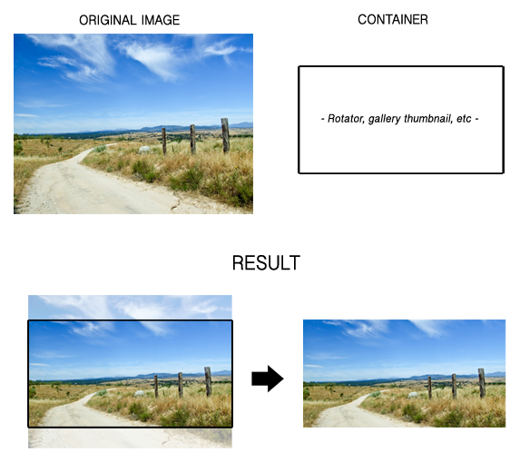
Specified Width & Height (cropping)
The image will be resized to fill the container's specified width and height (set in the template code). Then, the image is centered mathematically, and the excess on either side is cropped. This is best for images that need to fit a specifically-sized container exactly.
If the original image was not designed specifically for the container's proportions, you may or may not desire the cropping of the image from the exact center. For best results, note the dimensions of the container when producing your images.
Below is an example of this method:
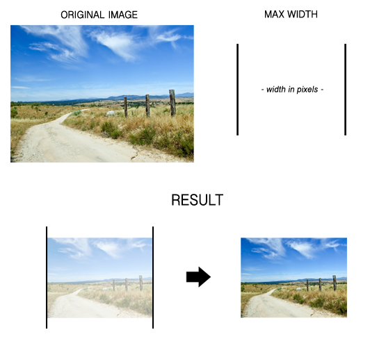
Maximum Width & Height (no cropping)
With this method, the image will be resized proportionally only if the image exceeds the maximum width, maximum height, or both (set in the template code), and no cropping is used. This is great for gallery images which don't need to be confined to specific dimensions, but need to at least be smaller than the user's screen size. Below is an example of this method (shown for Width):
Important notes about image caching:
- Images smaller than the specified size will not be enlarged.
- Images are resized proportionally. If you wish, dimensions can be set in the HTML code to force the image to a specified size disproportionally ("stretching").
- If you routinely optimize your images for your website, you may have no need of Image Caching. Contact us to have it disabled for the given containers. One benefit of disabling Image Caching is a very slight improvement in image quality (the system must recompress the resized image before storing it).
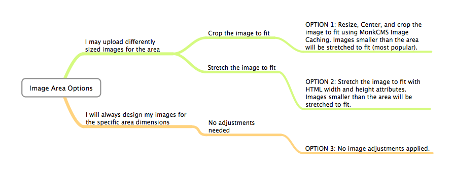
Deciding on image options
For each designated image area in a site template, a developer can build in your custom image options according to your specific preferences. See the flowchart below for determining your image options for rotators, header images, etc.